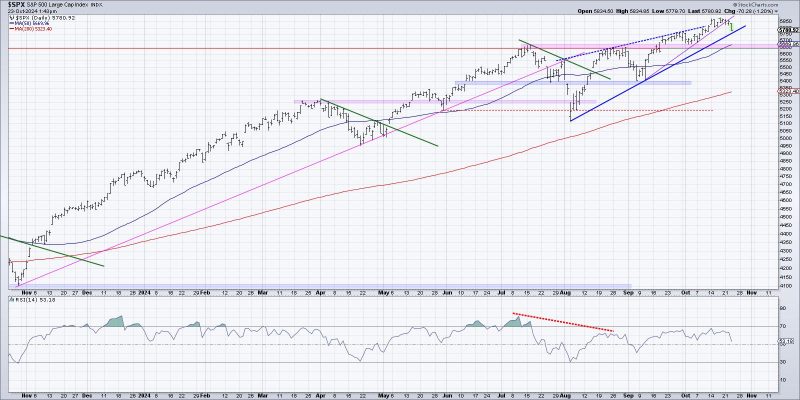
Visualizing the Start of a Potential Distribution Phase for Investors
Understanding market trends and patterns is crucial for investors seeking to make informed decisions. Recognizing the onset of a potential distribution phase can provide valuable insights into market dynamics and possible future movements. By visualizing key indicators, investors can improve their ability to analyze market conditions and adjust their investment strategies accordingly. In this article, we will explore three effective ways investors can visualize the start of a potential distribution phase.
1. Volume Analysis:
One of the primary indicators of a potential distribution phase is changes in trading volume. Analyzing volume patterns can help investors detect shifts in market sentiment and potential distribution among market participants. A key aspect to consider in volume analysis is identifying disproportionate selling volume compared to buying volume. This imbalance could indicate that institutional investors or large traders are offloading their positions, potentially signaling a distribution phase. By visualizing volume through bar charts or volume histograms, investors can gain valuable insights into market activity and potential distribution trends.
2. Price Action and Support Levels:
Monitoring price action and support levels is essential for identifying the start of a potential distribution phase. During a distribution phase, prices may exhibit a lack of upward momentum or struggle to break through key resistance levels. Additionally, observing price consolidation or a series of lower highs and lower lows could indicate a shift in market dynamics towards distribution. By visualizing price data through candlestick charts or line graphs, investors can track price movements and identify potential distribution patterns. Paying close attention to support levels and the reaction of prices at these levels can offer valuable clues about market sentiment and the possibility of a distribution phase.
3. Relative Strength and Divergence Analysis:
Another effective way to visualize the start of a potential distribution phase is through relative strength analysis and divergence patterns. By comparing the performance of a particular asset to a benchmark index or related securities, investors can gauge the relative strength of the asset in question. Divergence between the asset’s performance and that of the benchmark index could indicate underlying weakness and potential distribution. Visualizing relative strength through line graphs or oscillator indicators can help investors spot divergence patterns and anticipate a potential distribution phase. Monitoring changes in relative strength over time can provide valuable insights into market trends and potential distribution dynamics.
In conclusion, visualizing the start of a potential distribution phase is essential for investors looking to navigate changing market conditions and make informed investment decisions. By incorporating volume analysis, price action observation, and relative strength analysis into their investment process, investors can enhance their ability to recognize distribution patterns and adjust their strategies accordingly. Utilizing visual tools such as charts, graphs, and indicators can help investors interpret market data effectively and stay ahead of potential distribution phases. By staying vigilant and proactive in their analysis, investors can position themselves to better navigate market uncertainties and capitalize on emerging opportunities.
